
Scribd: Download Improvements
Cleaning up the download experience on Scribd
Overview
-
Time to launch
• 2 weeks design
• 2 weeks development
• 1 month testing -
Team structure
• 1 Designer- Me!
• 1 Product Manager
• 1 Technical Project Manager
• 2 Developers
• 1 QA Engineers
• 1 Data Analyst -
Testing methods
• UserTesting
• In product n-way test
Challenge
Roughly 61% of day zero trial users download a document after signing up, with the large majority of it happening in the first session. Once they download, they often leave Scribd and never return. How can we better direct these users to take an additional action in their first session?
My Role
I worked alongside my product partner to come up with the project, and then owned the explorations from concept to completion. Our squad at the time consisted of 2 engineers, 1 technical project manager, 1 QA engineer, and 1 data analyst
Context: Existing Experience
Pre-Download
A user clicking download is presented with format selections and a primary CTA, as well as numerous titles they can save to their library
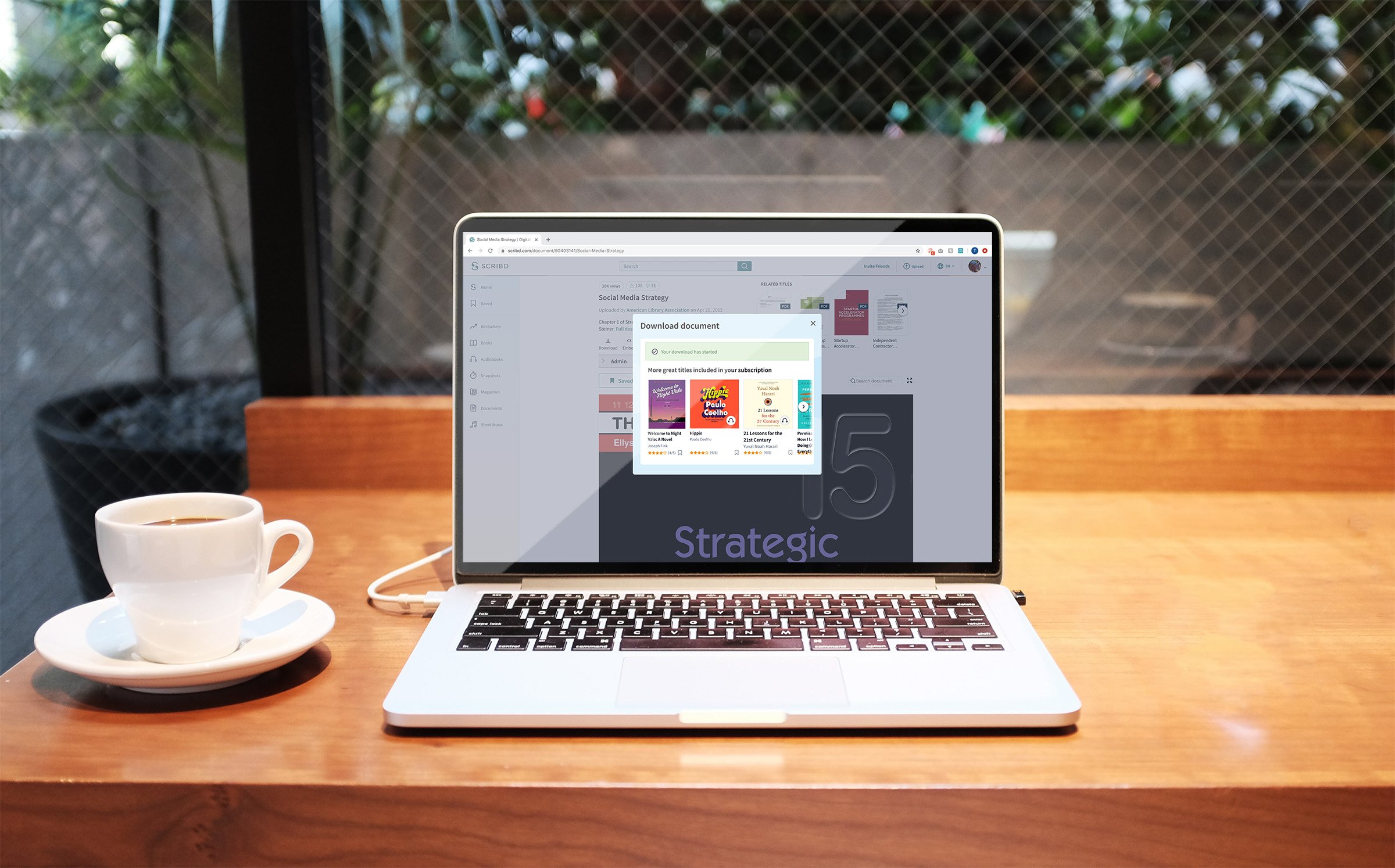
Post-Download
On download start, the top section is replaced with a notification that the download has started. The lower section asked users to save titles is unchanged.
User Insights
When asked to go through the download experience, users largely ignored the suggested titles at the bottom of the dialog
Several users didn’t observe the download starting and clicked “retry download” as many as 6 times
Hypothesis
Given the user confusion of the lower half of the dialog, we believe that focusing the pre-download experience on the download itself, and that we can then better pivot the user when the download has begun.
Initial explorations
“Get the app”
We’ve seen that app users have historically retained better than web users, so we explored pushing users to the app here
“Included in your membership”
At the time this feature was launched, Scribd had several free partner subscriptions available to Scribd members. For low-intent users we felt this would be a good opportunity to remind them of the value of their membership
Editorial Picks
Something we frequently tried to do with the trial experience is help users understand that full-length titles are included in their membership at no additional cost. In this mock-up we explored featuring a few titles, including the length of those titles, as well as clear CTA’s for users to jump into the content right away
User Insights
The feedback here from users was fairly non-directional. When compared to control, users felt the lower half was a bit more actionable and less overwhelming
No real preference toward any particular direction
Final Composites

Pre-Download Experience
This is a far more focused and minimal download experience. We removed all of the “save now” section, and opted for a dropdown for the format selector. The goal here was to get out of the way and let the user accomplish their goal.

Post-Download experience
We also removed much of the previous control experience here. In our testing we observed multiple users clicking “retry download” multiple times not realizing that the download was completed successfully.
Since the other feedback was fairly non-directional, we aimed for the cost effective solution of using an existing carousel component.
Download improvements results
Test analysis period: 5/20/20 - 7/13/20
Total assignments in test: 428K users split across two variants
% Download modal CTR
+51.6%
% BTR