
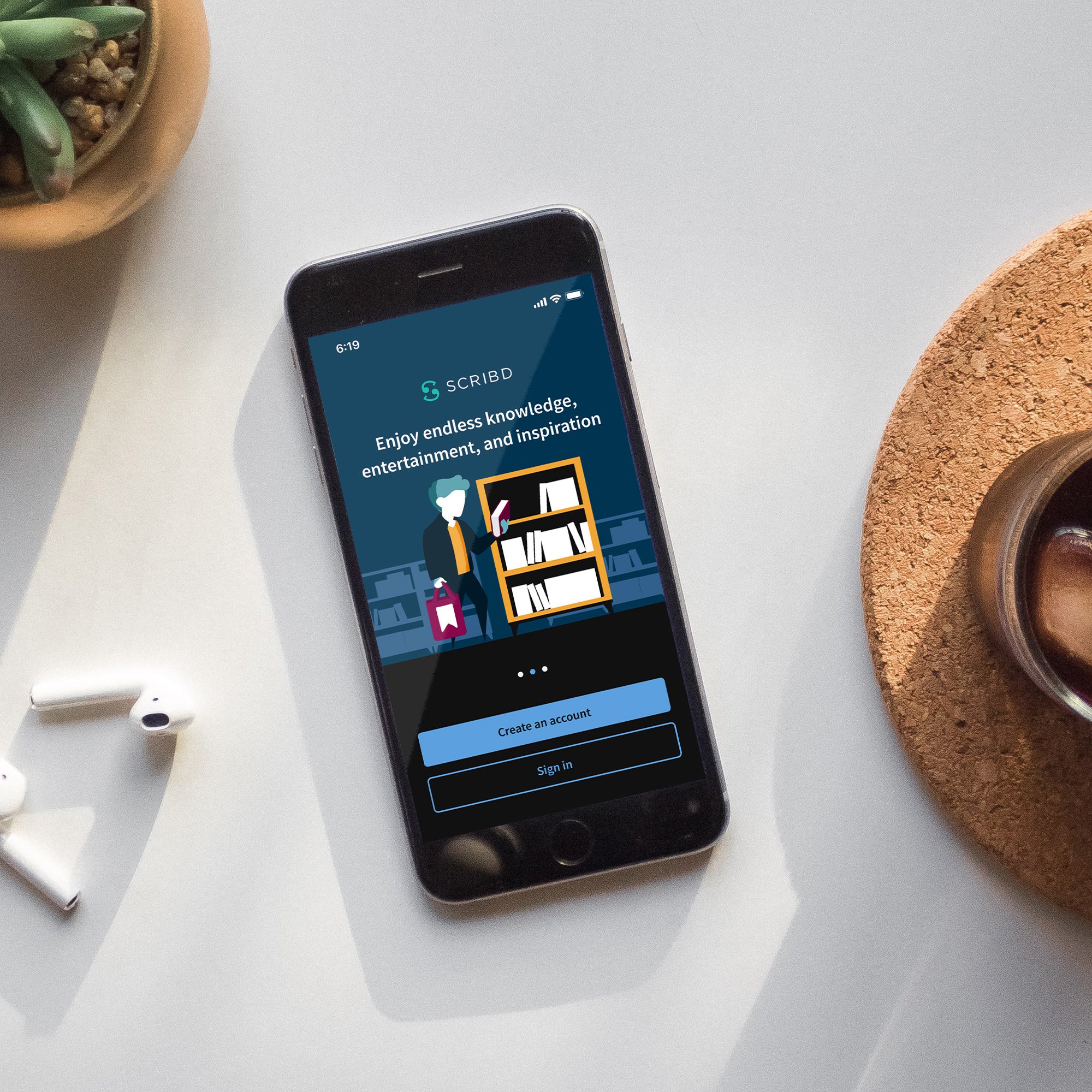
Scribd: Mobile App Intro
A refresh of the mobile app intro experience for Scribd
Overview
-
Time to launch
• 2 months design
• 1 month development
• 1 month testing -
Team structure
• 1 Designer- Me!
• 1 Engineering manager
• 2 Developers (Android)
• 2 Developers (iOS)
• 2 QA Engineers (Android)
• 2 QA Engineers (iOS) -
Testing methods
• UserTesting
• In product n-way test
Challenge
The app intro is the first interaction a new user has with Scribd. It’s our first, and currently only, time to pitch our product to a prospective user. Update the current app intro UX. It is outdated both from a design and content strategy standpoint. We desire to refresh experience to help increase the number of users who create an account and ultimately go on to sign up for a free trial
Context
A look at the existing App Intro experience.
Pre-sign up bounce rate: iOS 28%, Android 50%
Hypothesis
As a team we learned over multiple tests that helping users feel more at ease during decisive moments leads to a more successful attempt to convert a prospective user. So, If we simplify the messaging to reduce the fear of being billed, and pivot from showcasing hit-or-miss content to instead talking about the product experience– we could therefore increase sign-up rate.
Competitive Analysis
-
![]()
Audible
Audible has the benefit of being a household name, and says very little about their product during the App Intro
-
![]()
Blinkist
Blinkist focuses on the usefulness of the product and features
-
![]()
Curio
Curio focuses on the usefulness of the product, features, and how it fits into a users life
-
![]()
Duolingo
Duolingo has a free option, so instead saves this introduction for later in the experience to allow users to experience the value first.
-
![]()
Asana
Asana strictly focuses on personal benefits from how the product fits into your life with minimal branding.
-
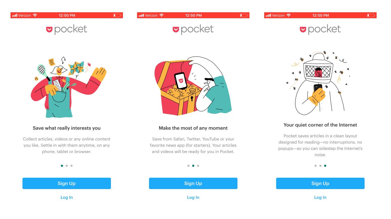
![]()
Pocket
Pocket uses a heavily branded and playful experience while focusing on the personal benefits of using the service.


Initial Explorations
Light Touch
Simply put- this was a light touch exploration. I really wanted to implement the 2 CTA’s at the bottom under the theory that “a user should be able to sign up whenever they want without having to finish the app intro”
This also removes the “Free for 30 days. Cancel Anytime” text on each screen
No Device Inset
this exploration was to try to remove the inset device within a device look of the control screens. Unfortunately, showing UI elements at full screen looks waaaay too interactive
Branded Illustrations
Using our brand illustrations helped to make the onboarding experience feel more friendly and this was the direction we moved forward with. Something that started to bother me though was that if we went with this direction we weren’t showing ANY content covers in the intro screens- and if a user wasn’t paying attention in the App Store, they might have even less of an idea of what Scribd is now!
User Insights
Illustrations performed the best across the board
Users noted the illustrations felt premium and gave a branded feeling to the experience. also that it felt approachable and plaful.
However, there were questions brought up about “what exactly does this product offer.” and that removing the content thumbnails was slightly more confusing for some users.
Increasing Scope and Mid-Fi
While the illustration approach tested really well both internally and with users, we decided to dig a little deeper on ways to content thumbnails before the illustration screens to set context for product. I identified that the splash/app loader screen would be the ideal place to show some content, and repurposed a cover matrix from the “sign up/sign in” screen to populate the splash screen
User Insights
Adding the thumbnails seemingly fixed the product offering question that some of the initial user set had. This updated illustration set was tested alongside the previous variants (with added color) to ensure the illustration concept still performed the strongest.
Final Composites
App intro refresh results
Analysis period: 08/04/2021 - 09/08/2021
Total assignments in test: 530K (evenly split across two variants)
iOS
-
+13.8%
Accounts Created
-
+7.8%
Searched within 7 days
-
+8.4%
Viewed a preview page within 7 days
-
+4.1%
Opened content within 7 days
Android
-
+17.5%
Accounts Created
-
+18.8%
Searched within 7 days
-
+19.9%
Viewed a preview page within 7 days
-
+12.4%
Opened content within 7 days