
Scribd: Membership Benefits
Spelling out the Scribd product offering to users on a separate account settings page
Overview
-
Time to launch
• 1 months design
• 1 month development -
Team structure
• 1 Designer- Me!
• 1 Head of Product
• 1 Developer
• 1 QA Engineer -
Testing methods
• UserTesting
• In product n-way test
Challenge
Create a place within account settings where a user can see all the value that their Scribd membership provides them.
User Insights
As a trial user or paying subscriber, I want Scribd to tell me all the benefits that come with my membership before thinking of canceling so that I can be assured I understand the full value of Scribd.
As Scribd, I want to have a page in between account settings and the cancellation flow that didactically spells out all of our product offering so that we can ensure all subscribers will have seen the full value of Scribd before cancelling their membership
Hypothesis
Many users cancel their trial membership without opening a single piece of premium content. We believe that by spelling out the value of their membership within the account settings space, a user will more fully understand the benefit of their membership and will be less likely to cancel.
My Role
I lead the design effort end-to-end on this feature. This project was done at a time when product and design didn’t yet work as closely at Scribd, so I mostly worked with the Head of Product for reviews and feedback.
Inspiration

Account Settings Entry Point
Link Text
We first explored having link text under the “Membership & Payment Details” section that would take a user to the new membership page
Callout card to Membership page
I explored removing the content icon matrix to simplify and shorten the page, and then we would have a card on the right side to take you to the new membership page
Account Settings Entry Point: Final Composites
Callout card to Membership page
In our tests with users, they responded better to the callout card. There was some concern about nesting access to the plan details (and therefore cancellation) one click deeper. However, since our hypothesis was about finding a place to spell out the full benefit, we moved forward.
Initial Explorations: Membership Benefit Page
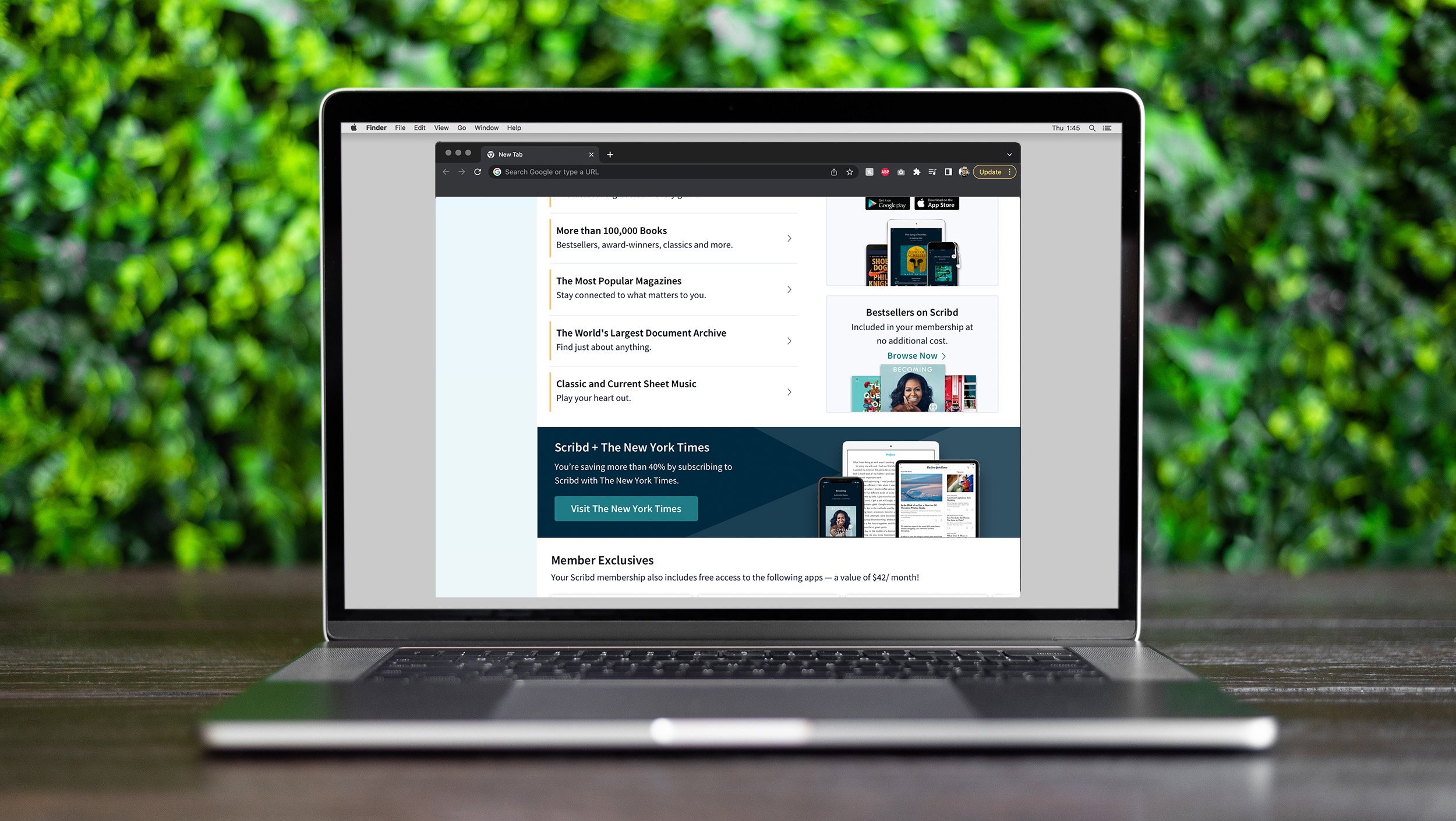
Final Composites: Membership Benefits Page
Membership Page Design
In the interest of spelling out the value of a user’s Scribd membership, a lot of information had to be squished into this page. Content types, breadth of catalog, app upsell, bestsellers, free bundled apps, New York Times upsell… and yes, plan details and cancellation options.
Some of the other variants were favored by users as being better looking visually, but the wrinkle there was that those users also had the most difficulty finding the plans/cancellation section. In the interest of being user-centric, we moved forward with the variant where all sections were easily discoverable.
Membership benefits results:
Test period: 02/20/2019 - 04/22/2019
Total assignments in test: 320k
Even though a sizable number of assignments were no longer seeing the cancellation flow, more important retention metrics, such as BTR and cancellation rates, were decreasing by significant amounts. We stuck with the control variant.
% Viewed cancel flow
-2.4%
% Trial members viewed cancel flow
-2.5%
% Subscribers cancelled
+1.9%
% Change to BTR
-1.8%
% Trial members cancelled